Why Roman Caps
The alphabet that everyone loves to hate
by Barry Morentz

Trajan’s Forum and Column in Rome, Italy. Photos by Carl Rohrs, September 2017.
How many times have you heard it said in a workshop: “Roman Capitals?? I don’t go near them!” or “Roman Capitals…I just can’t do them”, or “I really don’t need them for my work” or, best yet, “That’s not calligraphy…that’s printing!!!”
AAAAAAHHHH!
The truth is that the Roman Majuscule “Capitalis Monumentalis” is unquestionably the most majestic and seductive alphabet produced in the West in over 2000 years. And it is with us everywhere we go, from street signs to advertising to government buildings and museums, and very often even unto our final resting places. It is far more than an accident of history that these sublime letterforms have traveled the corridors of time and show little, if any, hint of ever being deflected from their infinite paths of deployment.
Yes, they ARE difficult to render with pen and ink. But let us first remember that this alphabet was originally designed to be carved in stone, not for the writing of manuscripts. The Roman alphabet evolved from Greek forms of the 5th century BC and slowly developed into the elegant and sophisticated letters that adorn the great monuments of ancient Rome and the wealthier cities scattered throughout the Roman Empire. The letters attained their highest degree of refinement during the late 1st -mid 2nd century AD when the Empire was at peace (Pax Romana) and at the peak of its prosperity. The intention was to extol the deeds and accomplishments of the emperors in as resounding a manner as possible; hence carving them in marble on the temples, arches and great public buildings explains the nomenclature of Monumental Capitals. Just as they strike fear and trepidation in neophyte scribes, so too were they meant to convey a feeling of awe and power in the viewer as he/she wended his/her way through the crowds on the way to the forum or the gladiatorial games.
““Matinée today: VORENUS vs PULLO”
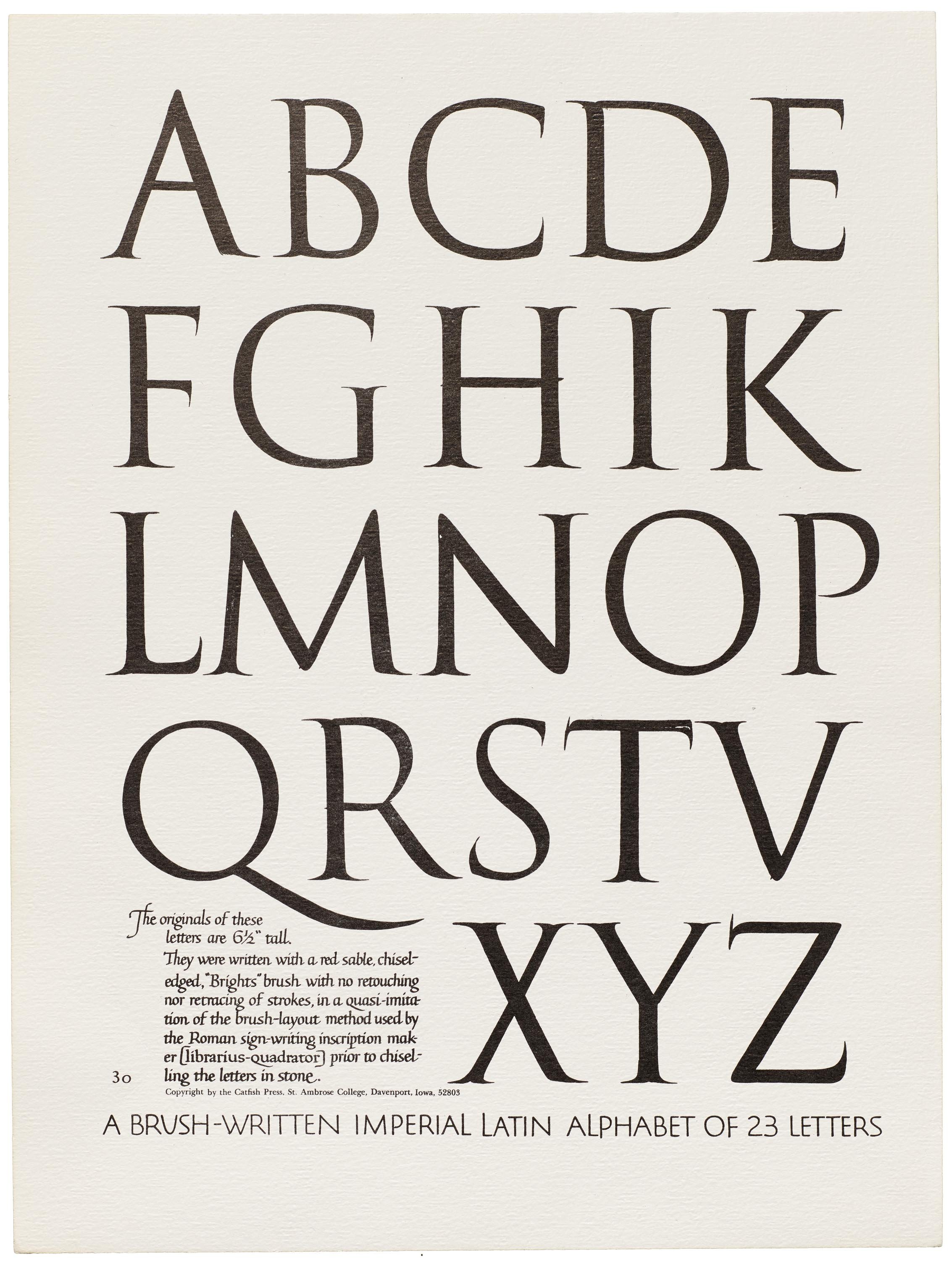
A leaf from Edward Catich’s Brush Written Letters, a portfolio included with the deluxe edition of The Origin of the Serif, 1969.
You may understandably feel that you are in the arena facing challenging odds, but with sustained, diligent practice and regular critique from an acknowledged scribe you will eventually brandish your pen with confidence. Always remember that the eye learns faster than the hand, and although your early work may not yet be worthy of the Temple of Venus your eye will nonetheless be undergoing critical training in form and space that also translates into more judicious layouts and more beautiful letterforms, whether broad edge or pointed pen.
I began my study of Roman Caps in 1981 with no less a master than Julian Waters. Although I went to the class kicking and screaming, I quickly became mesmerized and ultimately bewitched by these awesome forms, and all these years later the challenge to create mouthwateringly beautiful Roman letters remains the same.
No less an authority than Sheila Waters believed that these letters are mystical and mysterious, and that ”somehow you never quite
get them.” What this really means is that the forms display an abundance of subtleties that are tantalizingly elusive, from the slight swelling at the heads to the even slighter swelling at the foot of the letter (a mimicry of the architectural concept of entasis, so prevalent in classical architecture), to the 4º angle off the vertical of the 1st stroke of M to the 6º of the right-hand stroke. “Who cares about 4º and 6º? Well, you do…and if you don’t, then you should. Because only then, when you begin to focus on these deceptively trivial elements does your calligraphy begin to achieve a sophistication and refinement that hitherto you may have only sporadically (and sometimes unwittingly) attained. Studying Roman Caps trains your hand to master greater control and touch incorporating techniques of pressure and release, and to write with strength and conviction. Your eye is likewise sensitized to correct rhythmic spacing and enables you to identify active counterspace as opposed to “dead” space that can ruin a design. A heading of beautifully rendered Romans is an immediate attention grabber, just as the emperors intended, and sets a tone of anticipation for what follows.
Yes, the alphabet requires a commitment of time and patience. Precise, voluptuous forms in general will not magically emerge after only a 2-day workshop, but the building blocks will have been put securely in place. Augustus Caesar, who reigned 41 years, declared that he found Rome a city of brick but left it a city of marble. And was Rome built in a day? Obviously, the effort to build The Eternal City was worth it.
“Exercitatio optimus est magister”
Images originally from the Letterform Archive.

About Barry
BARRY MORENTZ was motivated by his love for language and handwriting to study calligraphy. After 46 years he remains fascinated and challenged by the power and beauty of letterforms to dramatically convey the emotional power of a text. Shakespeare, Danté, and the music of Brahms, Elgar, Verdi and Wagner continually inspire his calligraphic interpretations.
In his midtown Manhattan residence he creates calligraphic works and hand-made books, boxes, and portfolios. He began his formal calligraphic studies, primarily with Sheila Waters, in 1977, and eventually with Gottfried Pott, Hermann Zapf, and numerous other calligraphic luminaries. A highlight of his education was paleographic studies in Rome and the Vatican Library.
He has taught at 5 international conferences and has led workshops in Tokyo, Hong Kong, Singapore, and throughout the US and Canada. In 2017 he presented an extensive talk and demonstration at the Pen Museum in Birmingham, UK. When not slumped over his writing desk he spends his time in gourmet food shops and cooking while bombing out on Wagnerian opera.