Online Workshop
Commercial Brush Lettering for Small Signs with John Downer
John Downer bridges the divide between the traditional sign painters of yesterday and the lettering artists of today. With more than 50 years of sign-painting experience, he is also a bestselling typeface designer and a fount of knowledge on commercial lettering traditions both inside and outside the United States. This is an opportunity to spend four full days working on your flat-brush chops with someone who’s seen it all!
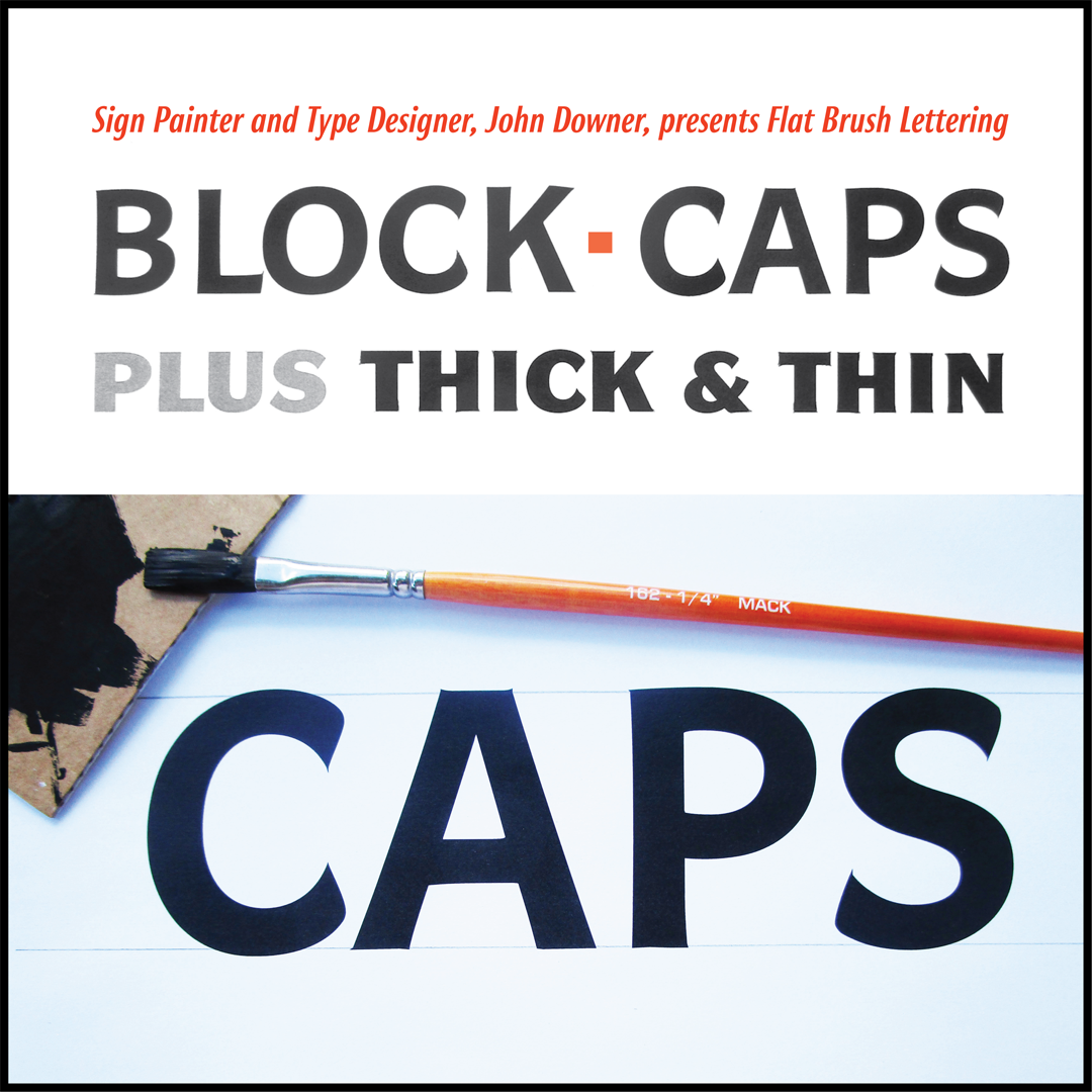
Block letters are the staple of American sign painting. They can be used effectively with pen lettering. Block letters are the basis for the sign painters’ traditional Thick and Thin letter styles, which have pronounced stroke contrast.
Block will be the subject of the first two days; Thick and Thin will be the subject of the second two days. We will concentrate on a convenient letter height of 2 inches.
Video recordings of all four days will be available for students to view afterwards.
Dates: October 16, 17, 30 and 31
Time: 11:00 am to 6:00 pm Eastern time (four full days, with a one-hour lunch break)
Price: $190 members / $220 non-members
(Society of Scribes members: check your email for the discount code!)
Max enrollment: 20
This class has sold out
Cancellation policy: A link to the online class will be emailed at least 72 hours before the first day of class. No refunds will be issued after October 12, 2021
MATERIALS LIST
A workspace with either a slanted board on a table of 15° to 45°, or a drafting table big enough to hold 14″ × 22″ card stock
Mack Golden Taklon 1/4″ series 162 flat brush, or Robert Simmons Sapphire S21 1/4″ synthetic flat brush
Blick Premium Tempera, black, (bottle); or Master Class tempera, black, (tube).
4 ea. 22″ × 28″ sheets of white railroad board. Please cut each sheet in half to yield two pieces 14″ by 22″ as our standard working size. (If you cannot obtain railroad board, get stiff double-sided white card stock from a print shop. The material must be strong enough not to wrinkle if it absorbs tempera paint.)
12 ea. 4″ × 4″ scraps of corrugated cardboard
stick charcoal
soft lead pencil
kneadable eraser
masking tape
clear or frosted cellophane tape
plastic drinking cups to use as water containers
rags, pepper towels
ruler, or half of a yardstick
apron or smock
bar soap for brush clean up
Optional: access to a printer to print out exemplars

ABOUT THE INSTRUCTOR
John Downer is a sign painter, typeface designer, and educator. He has written about type and type history for various publications and is widely known as a perceptive type critic. Among his most popular type designs are Iowan Old Style (included in Apple Books and iOS 7+), Roxy, Ironmonger, and Brothers, which appears frequently on food and beverage branding as well as on movie posters.
John began his apprenticeship in a sign-painting shop at age 18 and has been a journeyman sign painter since 1973, a freelance typeface designer since 1983, and a crusader for designers’ rights his entire adult life. He began teaching lettering at the university level in 1972, making him one of the most experienced American educators in the fields of lettering and typeface design.
John has taught for the Type@Cooper program at The Cooper Union since its founding in 2010. He established the Sign Painting Support Group on Facebook as a platform to educate and guide serious enthusiasts and professionals in the principles of letter construction and the tricks of the trade, and it has become one of the most valuable resources for sign painting online.
He holds BA, MA, and MFA degrees in art. Follow him on Instagram.